Those working on this mod do so in their own free time and for no pay.
Show your support for them by enabling ads on this site!

Author Topic: UI Rework Preview Pt. I  (Read 2288 times)

0 Members and 1 Guest are viewing this topic.

March 01, 2015, 02:23:05 PM

Offline Corey

  • Mod Leader
  • Administrator
  • Emperor
  • *****
  • Posts: 7,520
  • Approval: +410/-80
  • Dream Crusher
    • View Profile
UI Rework Preview Pt. I
« on: March 01, 2015, 02:23:05 PM »
As we discussed, OzWolf is reworking the UI for 0.95 again based on the feedback we've received, as well as finishing other parts of it (Fleet Logistic screen)

Here's a rundown of what we're doing:
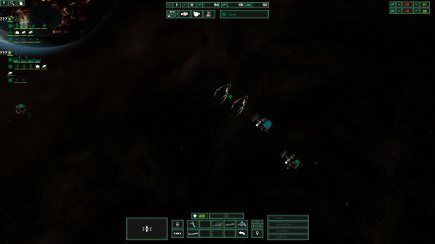
1. Keep the minimalist style/rearranged so the gameplay field is as unobstructed as possible.

2. Unit/ability/tech icons not achromatic. Keeping overall ability/research icon style of simple symbols that communicate what they do, but more colour to help differentiate at a glance.

3. Alert windows now text instead of pictures. More compact, and now I find them a lot more useful.

4. Rename button now says name, as opposed to being an arrow pointing up.

5. Planet icons: You'll see them later.

Click to embiggen.

I also have a YouTube channel where I talk about mod development and gaming, do tutorials, and Let's Plays. If you like the content, consider supporting it on Patreon


March 02, 2015, 03:53:47 AMReply #1

Offline Brutoni

  • Brevet Admiral
  • ****
  • Posts: 51
  • Approval: +0/-0
    • View Profile
Re: UI Rework Preview Pt. I
« Reply #1 on: March 02, 2015, 03:53:47 AM »
I like it. Very clean. A few questions if I may though?

1) Would it be possible to have the resources below the menu bars? I know that sounds silly but resources are something you will want as clear as possible in your peripheral vision whereas whenever you want the research/diplomacy/main menu buttons you will be looking at them directly anyhow....

2) Obviously it was mentioned in another post that star wars ship icons can end up similar. I still think the modding teams idea of using a modified NATO tactical symbols style is the way to go for that and would like to reaffirm that here.


Anyway that is all I have in terms of constructive thoughts. Not much but that's because the UI is clean, minimalist but appears to give you all the data you want. Pretty much spot on and eagerly await the opportunity to use it.

March 03, 2015, 06:53:08 AMReply #2

Offline OzWolf

  • Mod Team Member
  • Stormtrooper Captain
  • ****
  • Posts: 20
  • Approval: +4/-0
    • View Profile
Re: UI Rework Preview Pt. I
« Reply #2 on: March 03, 2015, 06:53:08 AM »
1) Would it be possible to have the resources below the menu bars? I know that sounds silly but resources are something you will want as clear as possible in your peripheral vision whereas whenever you want the research/diplomacy/main menu buttons you will be looking at them directly anyhow....

Very good suggestion and implemented.

Resources now sit below the menu and name plate.


Those working on this mod do so in their own free time and for no pay.
Show your support for them by enabling ads on this site!